Improved Conversion Rate By 60%, Eliminating $2.5 Million in Annual Ad Spend
63%
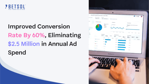
Improvement in overall conversion rate.
$2.5 million
With higher conversion rates, reduced annual ad spend by $2.5 million.
45 screens
Designs across 45 screens for all three countries were improved.
31%
Reduction in the number of words led to simpler user experience.
Key Challenges :
- Only 5.3% of people hitting the registration page completed registration.
- The client’s registration process was found to be a lengthy, low-trust experience.
- To meet registration goals, the client was forced to use an inflated advertising budget, wasting dollars.
GOALS:
- Simplify the user journey and increase the conversion rate.
- Build trust and credibility during the registration process.
- Add business value by reducing advertising expenses while increasing the agent talent pool.
Solution:
- Observed and interviewed potential registrants and premier service partners.
- Changes were made to the design and content of the registration form based on user research and affinity mapping.
- Reduced the number of words by 31%. This made the experience simpler and more relevant.
- Social proofing was added across every element. Simple explanations were added strategically.
- Best UI/UX practices were followed. Visually appealing proposed designs, simplified user journeys, and business-friendly analytics accompanied by a rapid and interactive tech stack were implemented.
- The current registration process was broken down into steps and gamified. Follow-up systems were established based on persuasion techniques to keep the potential registrants engaged.
- Formatting was fixed and designs across 45 screens for all three countries were improved.
- 27 basic typos were fixed. Elements that could be perceived as negative were rephrased. Referrals and the ID system were standardized.
Results:
- The conversion rate increased to 8.6%.
- There’s a 63% improvement in comparison to the previous conversion rate. When extrapolated over time, this was consistent.
- Thanks to higher conversion rates, reduced annual ad spending by $2.5 million.